Graphic design is an art form that merges creativity with strategic thinking to convey messages visually. At its core, it comprises several principles that, when understood and applied effectively, can elevate a design from ordinary to extraordinary. Let’s explore some of these essential concepts that form the bedrock of impactful graphic design.
Color Theory
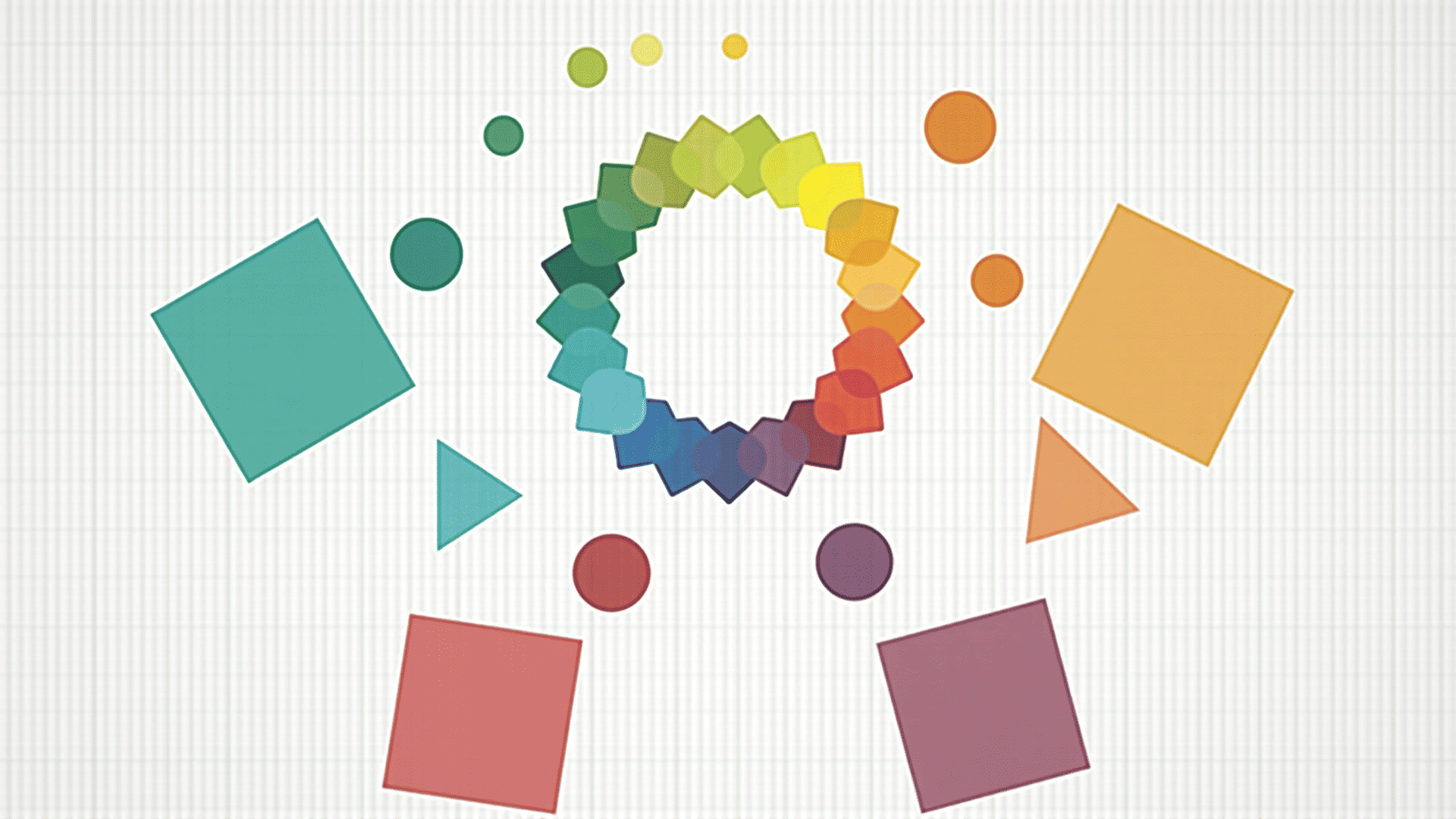
Color is a powerful tool in a designer’s arsenal, capable of evoking emotions and influencing perception. Understanding color theory is fundamental. It involves the study of colors, their relationships, and the visual effects of their combinations. The color wheel is a basic representation that helps designers create color schemes, including complementary, analogous, and triadic pairings. Each choice can set the tone for the design, whether aiming for harmony, contrast, or balance.
Typography
Words are more than just a medium for information—they also convey a visual message. Typography, the art of arranging type, is critical in the design process. It involves selecting typefaces, point sizes, line lengths, and letter spacing to ensure readability and aesthetic appeal. Typography has the power to reflect the mood and personality of the content. Pairing different typefaces thoughtfully can enhance the overall look of the design.
Balance and Alignment
Balance refers to the distribution of visual elements in a design. It can be symmetrical, where elements are evenly distributed, or asymmetrical, where different elements balance each other out. Alignment, on the other hand, ensures elements have a visual connection with each other, enhancing the structure and organization of the design. Both balance and alignment are crucial for creating a cohesive and orderly layout that guides the viewer’s eye effectively.
Hierarchy
Visual hierarchy is the arrangement of elements to indicate importance. It helps guide the viewer’s attention through the design in a desired sequence. Tools such as size, color, contrast, and spacing can be used to emphasize or de-emphasize components. For instance, a larger font size can indicate prominence, while a vibrant color can draw attention to critical information.
Contrast
Contrast is about creating emphasis by juxtaposing elements with different qualities. This can include differences in color, size, shape, or texture. High contrast can make designs more dynamic and improve readability, especially for text-heavy content. The strategic use of contrast ensures that key elements stand out, making the communication clear and effective.
Repetition
Repetition is the reuse of certain design elements, which ties different parts of the design together, creating consistency. This can be seen in the use of colors, shapes, or fonts throughout a design project. Repetition helps reinforce an idea or motif, making the design more recognizable and cohesive.
Proximity
The principle of proximity involves grouping related items together to create a relationship between them. It declutters the design, helping in the logical organization of information. Elements that are close together are perceived to be more related than those spaced further apart. This principle aids in creating an intuitive path for the viewer to follow.
Space
Often referred to as negative space, space is the portion of the design that is left unmarked. It surrounds visual elements and provides breathing room, aiding in clarity and focus. Effective use of space ensures that the layout is not overwhelming and that important elements are highlighted.
In conclusion, mastering these foundational elements helps in crafting designs that are not only visually appealing but also functionally effective. They form the basis upon which creativity and design skills are honed, leading to works that communicate their message clearly and powerfully. Understanding and applying these principles will elevate any designer's work, providing structure and meaning to their creative pursuits.