Color theory is an essential framework for anyone interested in the visual arts, providing a foundation to create compositions that not only draw the eye but also evoke emotional responses. This intricate field examines how colors interact with each other and how they can be combined to create appealing visual effects.
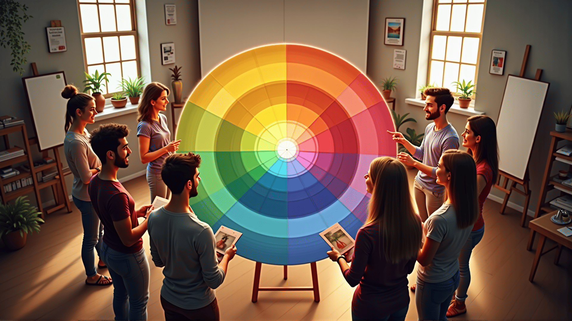
At the heart of color theory is the color wheel, a circular diagram that displays the relationships between primary, secondary, and tertiary colors. Primary colors—red, blue, and yellow—cannot be created by mixing other hues, but they can be combined to produce secondary colors like green, orange, and purple. Tertiary colors arise from mixing primary and secondary colors, creating nuanced shades like red-orange and blue-green that add depth to any artwork.
Understanding these relationships is crucial for achieving harmony in color combinations. Complementary colors, positioned opposite each other on the color wheel, create a vibrant contrast. For example, the stark juxtaposition of red and green makes each hue more intense and striking. However, the use of analogous colors, which sit next to each other on the wheel, results in a more subtle and cohesive look. This approach uses adjacent hues to establish a seamless gradient or transition.
Another important concept within color theory is color temperature, which classifies hues as warm or cool. Warm colors like red, orange, and yellow can evoke feelings of energy and warmth, reminiscent of sunlight or a roaring fire. In contrast, cool colors such as blue, green, and purple are often associated with calmness and tranquility, akin to a serene ocean or a clear sky. The strategic use of warm or cool colors can dramatically change the ambiance of a piece and elicit specific emotional responses from the viewer.
It's also important to consider the psychological impact of individual colors. Each hue can conjure specific emotions or ideas; for example, blue often conveys trust and tranquility, while red can signify passion or urgency. Artists and creators leverage these associations to communicate messages and themes effectively, tailoring color choices to the intended mood or cultural context.
Incorporating these principles into compositions requires not only a theoretical understanding but also an intuitive grasp of balance and contrast. Practice and experimentation can foster this intuition, allowing creators to observe how different combinations affect the overall mood of their work.
Mastering color theory enriches visual literacy and enhances the capacity to craft designs that captivate and resonate on an emotional level. Through exploring relationships among colors and their psychological impacts, one can transform simple combinations into powerful visual narratives that communicate more than words ever could.